About the Palette
The Warner Bros. Discovery color palette reflects the broad spectrum of content we create and deliver, from all points of view, nature to fantasy to hard-hitting journalism.
Vibrant, bold and expressive, the vivid primary color palette (inner circle) and more muted and neutral secondary palette (outer circle) open opportunities to take audiences out of their worlds, and immerse them in ours.
Color Specifications
Hero Palette
Our hero brand colors are Space Blue, Blue and Indigo.
Space Blue
- HEX #04006c
- RGB 4/0/108
- CMYK 100/98/19/27
- PMS 288
Blue
- HEX #015cfe
- RGB 1/92/254
- CMYK 82/64/0/0
- PMS 2175
Indigo
- HEX #5128f2
- RGB 81/40/242
- CMYK 78/77/0/0
- PMS 2098
Vivid Palette
Use RGB and Hex value for all digital applications.
For print, we recommend using RGB in cases where you can’t provide the Pantone values. We have found providing RGB and flagging to the printer so that they may best match the digital color with the way their specially calibrated machine yields the truest result.
Black
- HEX #000000
- RGB 0/0/0
- CMYK 0/0/0/100
- PMS Black 6
Sapphire
- HEX #0022af
- RGB 0/34/175
- CMYK 98/91/0/0
- PMS 293
Cyan
- HEX #00e0ff
- RGB 0/224/255
- CMYK 57/0/5/0
- PMS 306
Aquamarine
- HEX #29f5d5
- RGB 41/245/213
- CMYK 54/0/30/0
- PMS 3385
Forest Green
- HEX #007e1c
- RGB 0/126/28
- CMYK 87/25/100/14
- PMS 7740
Green
- HEX #0ac962
- RGB 10/201/98
- CMYK 71/0/84/0
- PMS 2270
Gold
- HEX #ffc200
- RGB 255/194/0
- CMYK 0/25/100/0
- PMS 7549
Orange
- HEX #ff8a35
- RGB 255/138/53
- CMYK 0/56/86/0
- PMS 2025
Sunset Orange
- HEX #fd5912
- RGB 253/89/18
- CMYK 0/80/100/0
- PMS 2026
Red
- HEX #ee2041
- RGB 238/32/65
- CMYK 0/98/74/0
- PMS 192
Pink
- HEX #ff71f2
- RGB 255/113/242
- CMYK 14/61/0/0
- PMS 238
Violet
- HEX #9000e8
- RGB 144/0/232
- CMYK 62/83/0/0
- PMS 266
Neutral Palette
The neutral palette provides some balance when needed to triads.
Colors from the neutral palette should never be used as the only color. They should always be paired with a hue from the hero or vivid palettes.
Gray
- HEX #c8c4c6
- RGB 200/196/198
- CMYK 21/19/17/0
- PMS Cool Gray 4
Gray Blue
- HEX #538cc6
- RGB 83/140/198
- CMYK 68/37/2/0
- PMS 2143
Dark Teal
- HEX #176886
- RGB 23/104/134
- CMYK 89/52/32/9
- PMS 2224
Teal
- HEX #00a7b5
- RGB 0/167/181
- CMYK 77/13/29/0
- PMS 7710
Emerald Green
- HEX #038566
- RGB 3/133/102
- CMYK 86/25/71/9
- PMS 569
Ochre
- HEX #ce7e46
- RGB 202/126/70
- CMYK 16/57/82/2
- PMS 7412
Earth
- HEX #af4f41
- RGB 175/79/65
- CMYK 23/79/76/12
- PMS 7523
Rose Pink
- HEX #dd6c98
- RGB 221/108/152
- CMYK 9/71/13/0
- PMS 2045
Mauve
- HEX #987ba5
- RGB 152/123/165
- CMYK 44/55/13/0
- PMS 667
Eggplant
- HEX #492478
- RGB 73/36/120
- CMYK 88/100/18/6
- PMS 3566
Dark Purple
- HEX #3b3758
- RGB 59/55/88
- CMYK 82/80/39/31
- PMS 5265
Color Pairings
When showcasing Warner Bros. Discovery as a brand without isolating specific IP or company divisions, a triad should be selected from one of five options. These are considered the primary triads.
Our primary brand triad is Space Blue, Blue and Indigo.
Primary Triads
| Color | Hex | RGB |
| Indigo | #5128f2 | 81/40/242 |
| Space Blue | #04006c | 4/0/108 |
| Blue | #015cfe | 1/92/254 |
| Color | Hex | RGB |
| Aquamarine | #29f5d5 | 41/245/213 |
| Dark Teal | #176886 | 23/104/134 |
| Emerald Green | #038566 | 3/133/102 |
| Color | Hex | RGB |
| Sapphire | #0022af | 0/34/175 |
| Space Blue | #04006c | 4/0//108 |
| Blue | #015cfe | 1/92/254 |
Usage
To achieve maximum impact and balance, our broad color spectrum works best when colors are combined in ways shown here. When using imagery within the framing device, the color of the device element should be within the same color family as the imagery. When only solid colors are used, pair our vivid palette with our neutral palette to create balance.
Always consider your audience and choose color and color pairings that are culturally appropriate.
We primarily use white, black and dark blue for type in our system. Ensure the type color has a sufficient amount of contrast with the background on which it appears, whether that be a photo, video or solid color. Type in other colors may be used for emphasis, e.g., CTAs, buttons, navigation, etc. See our accessibility chart for type and background color combinations that are ADA compliant.
Secondary Triads

Incorrect Usage
The examples on this page demonstrate incorrect ways of using our colors.
Don’t use similar color combinations that lack contrast.
Don’t tint our color palettes or use colors outside of our color wheel.
Don’t combine all vivid color palette colors. In most cases, always use at least one neutral.
Don’t use color typography. Our typography should only be white, black or dark blue.
Don’t execute in gray scale.
Don’t outline our frame devices. They are intended to hold imagery and color.
Accessibility
Accessibility is important to us.
We’ve tested our color palette according to Americans with Disabilities Act (ADA) Standards for Accessible Design to ensure our colors are accessible to all.
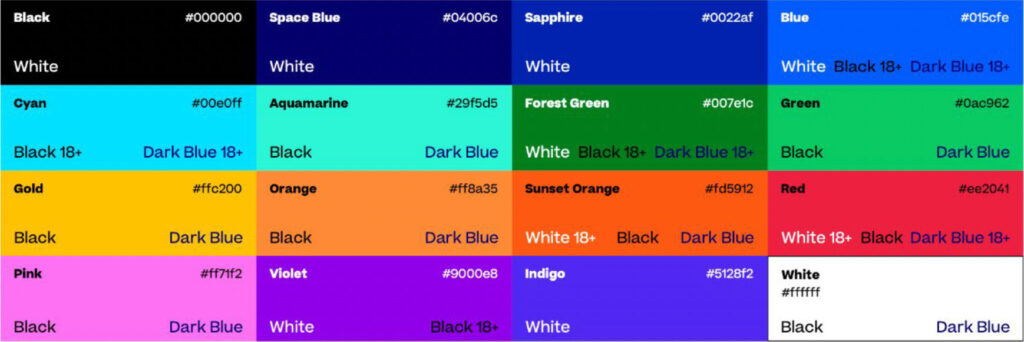
This chart is a guide to color combinations that have enough contrast to meet ADA AA compliance level requirements.
Our type colors are primarily black, white and dark blue. Font color names with 18+ denotes that copy must be over 18pt in size in order to be compliant. If the font color is not shown, it is not compliant and should not be used.
Vivid Palette

Neutral Palette

