Our Logo
Our logo includes both a symbol and a wordmark. They always work together and should never be separated.
We have two versions of our logo: horizontal and vertical. Use the one most appropriate for the space and layout.
Our logo assets are available with and without the registration mark. A registration mark should appear at least once on most touchpoints.
Exceptions
In digital content, the service mark can be omitted. However, It is preferred for legal reasons to include terms and conditions somewhere on the page (where acceptable).
- Exterior signage can omit service marks.
- Promotional items do not require service marks.
For any questions regarding logo trademark usage and terms & conditions, please reach out to the legal team.

Horizontal Logo
Use this version of the logo where the horizontal arrangement is most appropriate for the space and layout. Note that when the logo appears on a light-colored background, the wordmark is blue. When the logo appears on dark-colored backgrounds, the white wordmark is used.
Use the full-color shield wherever possible. When it is not possible to use the full-color version because of limited color production, use the provided all-black or all-white versions of the logo. For more information see the Usage section below.
To ensure legibility of our logos, we’ve prescribed minimum size and clear space rules. All logos at right should follow these rules. The one-color logos are shown smaller for demonstrative purposes only.
Always use the original and approved artwork; never alter or attempt to redraw or re-create the lettering using computer fonts.




Clear Space & Minimum Size
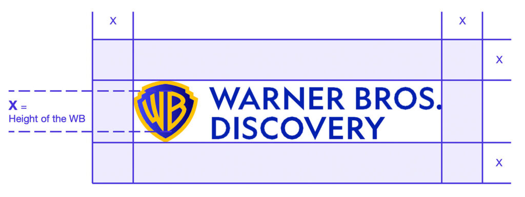
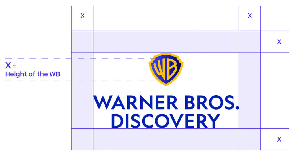
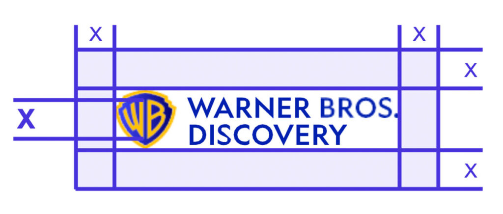
To ensure its integrity and visibility, the logo should be kept clear from competing text, images or graphics. The logo must be surrounded by an adequate clear space. For the horizontal logo, the clear space on all sides is, at minimum, equal to the height of the WB letters in the symbol.
Minimum size
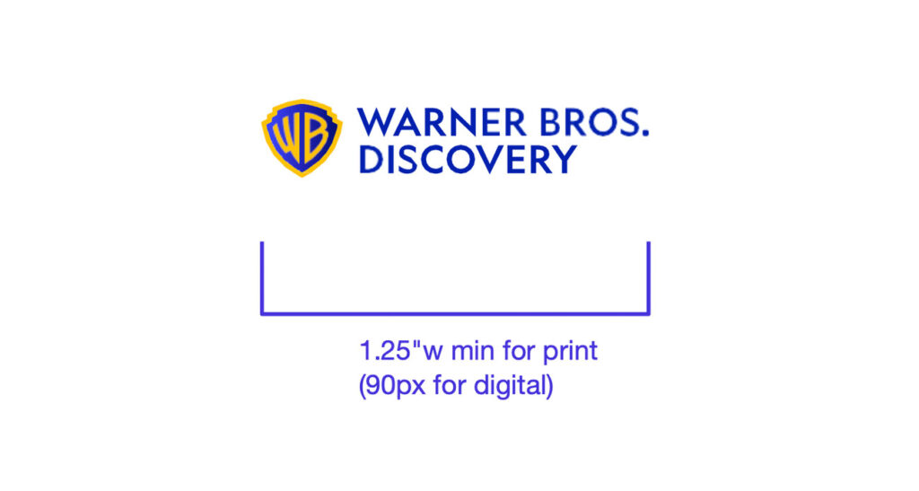
For the horizontal logo, the width of the logo should never appear smaller than 1.25″ in width when used in print materials, or 90 pixels in width when used in digital formats. If a smaller size is needed, refer to the special logo section for a special lockup for small sizes.
Vertical Logo
Use this version of the logo where the vertical arrangement is most appropriate for the space and layout. Note that when the logo appears on a light-colored background, the wordmark is blue. When the logo appears on dark-colored backgrounds, the white wordmark is used.
Use the full-color logo whenever possible. When it is not possible to use the full-color version because of limited color production, use the provided all-black or all-white versions of the logo. For more information see the Usage section below.
To ensure legibility of our logos, we’ve prescribed minimum size and clear space rules. All logos at right should follow these rules.




Clear Space & Minimum Size
Clear Space
To ensure its integrity and visibility, the logo should be kept clear from competing text, images, or graphics.
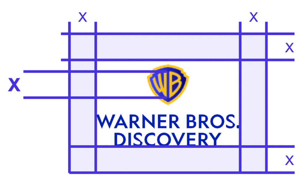
The logo must be surrounded by an adequate clear space. For the vertical logo, the clear space on all sides is, at minimum, equal to the height of the WB letters in the symbol.
Minimum Size
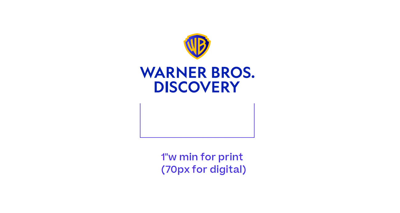
For the vertical logo, the width of the logo should never appear smaller than 1” in width when used in print materials, or 70 pixels in width when used in digital formats.
If a smaller size is needed, refer to the special logo section, for a special lockup for small sizes.
Special Logo
When the logo needs to be smaller than the minimum size, use the following versions.
These logos have been specially created with different proportions between the symbol and wordmark to allow for greater legibility in such smaller sizes. Only use these to optimize legibility when it is necessary to use smaller sizes. See the horizontal logo and the vertical logo for more information on minimum size.




Clear Space & Minimum Size
Maximum Size
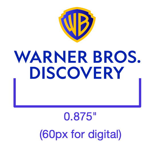
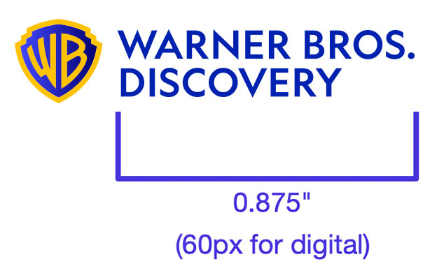
For the small-size vertical logo, the width of the logo should never appear wider than 0.875″ when used in print materials, or 60 pixels in width when used in digital formats. For the small-size horizontal logo, the wordmark should never appear wider than 0.875″ when used in print materials, or 60 pixels when used in digital formats.
Minimum Size
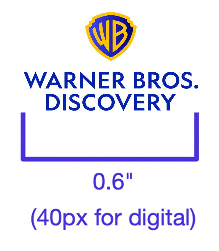
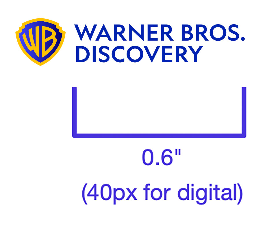
For the small-size vertical logo, the logo should never appear less than 0.6″ wide in print materials, or 40 pixels in digital formats. For the small-size horizontal logo, the wordmark should never appear less than 0.6″ wide in print materials, or 40 pixels in digital formats.
Clear Space
Maximum Size
Minimum Size
Symbol
The symbol is rarely used on its own. It should almost always be used with the wordmark.
Some exceptions are social media avatars (in cases when our full company name is present), select promotional items or when used as an abstract pattern (in cases when our full company name or logo is present).
When using the symbol as an abstract pattern it should be scaled large to emphasise its form and accompanied by the full logo.
Please use the Contact page for usage approval.

Usage
Full-Color Logo
Use the full-color versions of the logo wherever possible. Here we show examples of approved logo use on colored backgrounds. When placing the logo on colored backgrounds, make sure that the logo has sufficient contrast with the background to ensure visibility.
For maximum contrast, use the logo with the blue-colored wordmark on light-colored backgrounds (see top row). Use the logo with the white wordmark on dark-colored backgrounds (see middle row).
Full-color logo on white or light-colored background



Full-color logo on black or dark-colored background


Monocolor Logo
Use the all-black or all-white versions of the logo only if it’s not possible to use the full-color version due to limited color production such as one-color printing, newsprint, or foil-stamping. When this is the case;
- Use the all-white version of the logo on dark-colored backgrounds.
- Use the all-black version of the logo on light-colored backgrounds.
- The logo may also be produced in metallic silver or gold with foil-stamping.
One-color production on dark background

One-color production on light background

Specialty printing— foil-stamping

Contrast
When placing the logo on colored backgrounds, make sure that the logo has sufficient contrast with the background to ensure visibility.
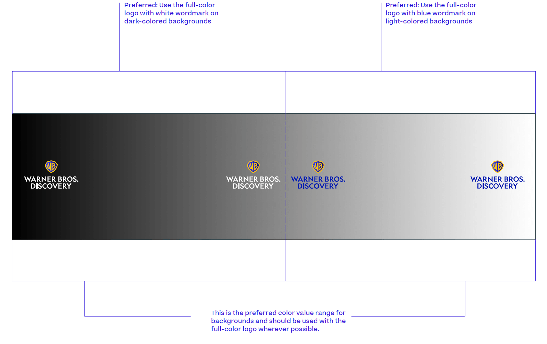
For maximum contrast, use the white wordmark logo on dark-colored background and use the blue wordmark logo on white or light-colored backgrounds, as shown in the examples here.
The chart on the right shows the appropriate use of logo color based on the background color value range. Use the full-color logo wherever possible. The full-color logo should never be placed on colors that do not provide sufficient contrast to the logo. For these special cases, use the approved one-color logos.
These examples apply to all Warner Bros. Discovery logos.
On Photography
Examples of the correct ways to use the logo with photography are shown here. Photography should be selected carefully for clarity and impact.
Because every image is different, be sure to choose an image whose colors provide strong contrast with the logo. Place the logo in an area of the image that is not visually “busy” for clarity. Always use well-composed, high-quality, high-resolution images.
The full-color versions of the logo should be used whenever possible. The logo must always have sufficient contrast with the background. When there is insufficient contrast, use the white or black logo. When it is necessary to produce the logo in one color—such as one-color newsprint—use the provided all-black or all-white artwork that has been specially created for one-color use.
These examples apply to all Warner Bros. Discovery logos.

Incorrect Usage
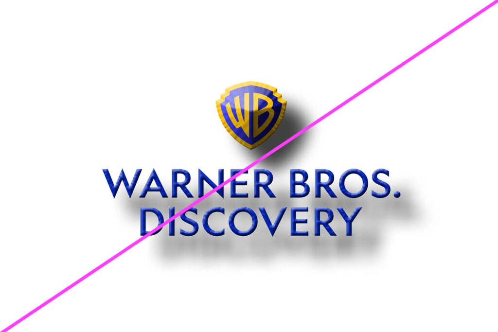
Use the logo correctly to maximize impact and consistency and to protect the value and integrity of our identity. Always reproduce the logo from original artwork files, and avoid improper logo usage.
These examples apply to all Warner Bros. Discovery logos.
