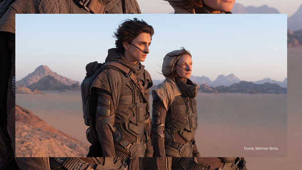
The Ripple Device is used to create depth. It evokes a sense of content coming toward the viewer, while drawing the viewer in.
One Image
- Compositions containing one image can work well with or without color frames.
- Use a color frame as a separator when the images don’t have enough contrast or have similar colors.
- Scale the image to help create depth. See the Magnified Imagery section for more detail.
- Monochromatic, atmospheric or textural imagery and solid brand colors can be used to help draw attention to the focal point.
See the Building a Ripple Device section for more information.
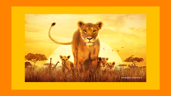
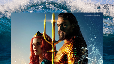
Two Images
- We recommend a maximum of two images for most placements.
- Compositions containing two images can work well with or without color frames. Use a color frame as a separator when the images don’t have enough contrast or have similar colors.
- Images can be from the same show/genre or multiple shows/genres.
- Subjects should be varied in scale to create a clear hierarchy and colors should be complementary and carefully chosen.
- Monochromatic, colorized, atmospheric or textural imagery and solid brand colors can be used to help draw attention to the focal point.
See the Building a Ripple Device section for more information.

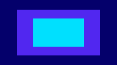
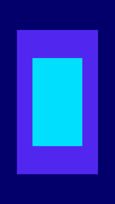
Color Only
- Color only compositions can be a striking option when typography is intended to be the only focus.
- Refer to the Color Pairings section.
See the Building a Ripple Device section for more information.

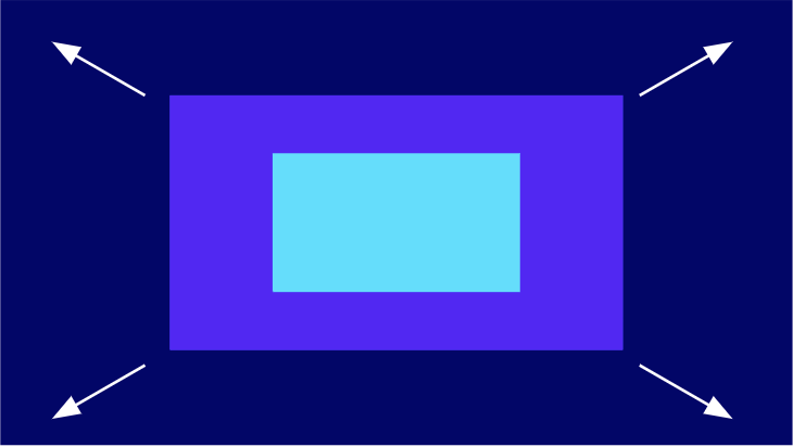
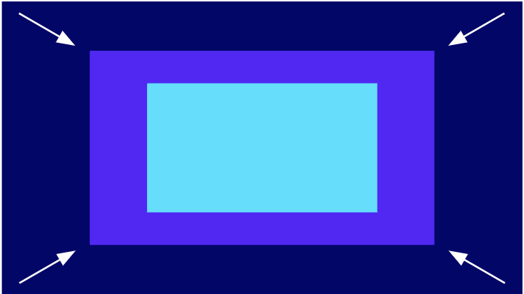
Building a Ripple Device
Sections can be equally spaced or varied and may also appear centered or cropped.
The Ripple Device can be used in a multitude of proportions and may differ from these examples shown. The height and width of sections can vary depending on use;
- When containing images or text the sections are generally thicker and when containing only color the section are generally thinner.
- On centered horizontal layouts the vertical lengths of each section are generally thicker than the horizontal lengths. On cropped horizontal layouts the length opposite the cropped side is generally the thickest.*
- On centered vertical layouts the horizontal lengths of each section is generally thicker than the vertical lengths. On cropped vertical layouts the length opposite the cropped side is generally the thickest.*
- On centered square layouts the vertical and horizontal lengths are even. On cropped square layouts the length opposite the cropped side is generally the thickest.*
* Exception: when using this device as a thin boarder (either with image or color) the vertical and horizontal lengths may be even.
We recommend a maximum of three sections for most placements, and two for smaller placements.
Attribution
Attribution must be included on all imagery/footage in Beatrice Medium (title case, 75% opacity) in the following format: ‘IP Title, Network/Studio‘. It can be positioned in any corner of the frame and should not interfere or draw attention from the subject.
Secondary Imagery
Monochromatic, atmospheric or textural imagery should be carefully chosen in color and composition to compliment the main focal point and not draw attention away it. Atmospheric or textural images should relate/add to the main focal point. Do not colorize imagery containing talent.

Motion
In the Motion Toolkit, the Ripple Device is used to create depth. It uses the Z space to create the illusion of content coming toward the viewers or moving away from them, drawing the viewers in. The thicknesses can be evenly spaced/paced or varied in width. The ripple devices can be applied vertically as well.
Avoid combining many ripples in your assets in quick succession or in very brief videos.
For color combinations, see the Color section.