Overview
Our typography is grounded in the primary font: Beatrice.
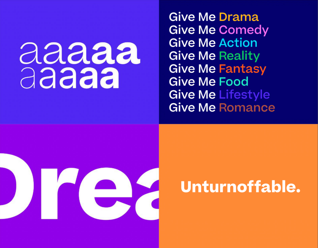
Beatrice is an elegant, welcoming and sophisticated family. It is distinctive, yet neutral, compatible with a wide range of portfolio brands as well as rich content.
It is also a nice accompaniment to our extensive and vibrant color palette and imagery.

Primary Font: Beatrice
As a single sans serif family with a variety of weights, Beatrice allows for ease of execution.
Its sharp, chiseled-almost calligraphic forms bring to it a subtle yet distinctive character.
It has a standard low-contrast cut, designed to function beautifully in a wide range of optical sizes. Beatrice is available in a wide range of weights and characters and flexes across digital and print applications.
Beatrice has been licensed globally in perpetuity in conjunction with Warner Bros. Discovery corporate branding. (Purchased from Sharp Type Foundry.)

Usage
Beatrice Bold, Semibold, and Light are the main weights for headlines and display copy.


Beatrice Regular and Semibold are the preferred weights to be used for copy. ……………
Sentence case capitalization is preferred. Headlines and subheads should not be set in all caps.

Specifications
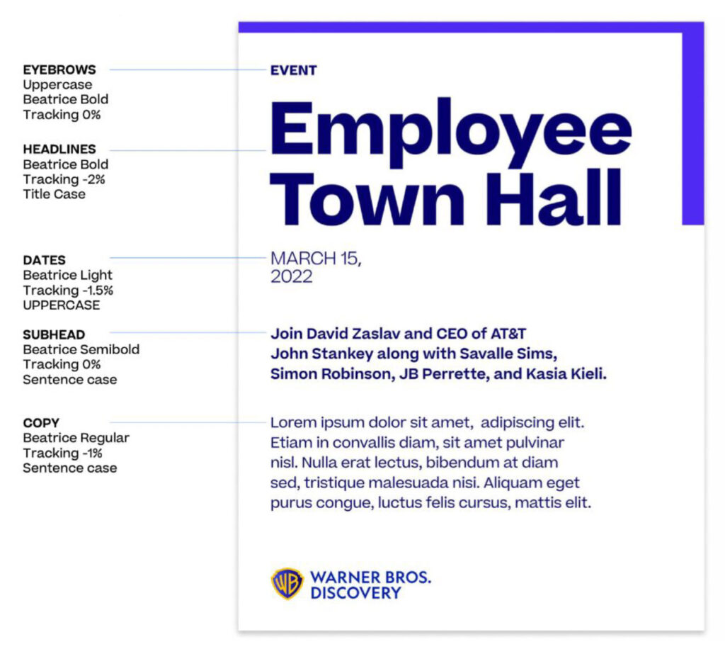
| Element | Font | Weight | Leading | Case | Tracking | |
|---|---|---|---|---|---|---|
| This is a Headline |
Headline | Beatrice | Bold | Font Size -4 | Title Case | -2% |
| This is an example of a subhead |
Subhead | Beatrice | Semibold | Font Size +4 | Sentence Case | 0% |
| This is an example of body copy. Lorem ipsum dolor sit amet, consectetur adipiscing elit suspendisse ut tortor quam. | Body Copy | Beatrice | Regular | Font Size x 1.5 | Sentence Case | -1% |
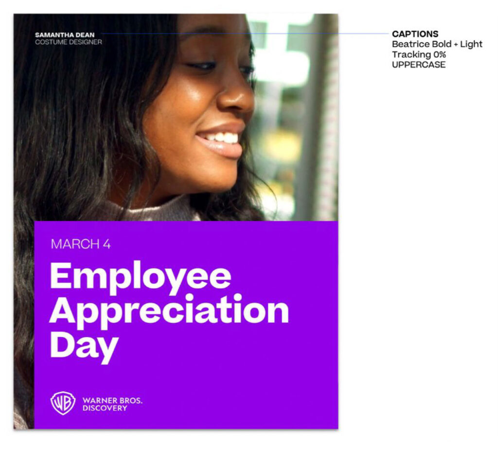
| David Zaslav President & CEO | Captions | Beatrice | Bold + Light | Font Size -2 | Uppercase | 0% |
Hierarchy
Secondary Font: Inter

Usage
Inter Bold, Semibold and Medium are the main weights for headlines and display copy.
Inter Regular and Semibold are the preferred weights to be used for copy.

Alternative Fonts
The following fonts are recommended as alternatives for international regions, subject to licensing, if required.
| Language | Typeface |
|---|---|
| Arabic | DIN Arabic |
| Japanese | Noto Sans CJK |
| Korean | Noto Sans CJK |
| Mandarin | Noto Sans CJK |
| Vietnamese | Noto Sans CJK |
| Chinese (Simplified), Chinese (Traditional), Chinese Pinyin | Noto Sans CJK |
| Hebrew | Noto Sans Hebrew |