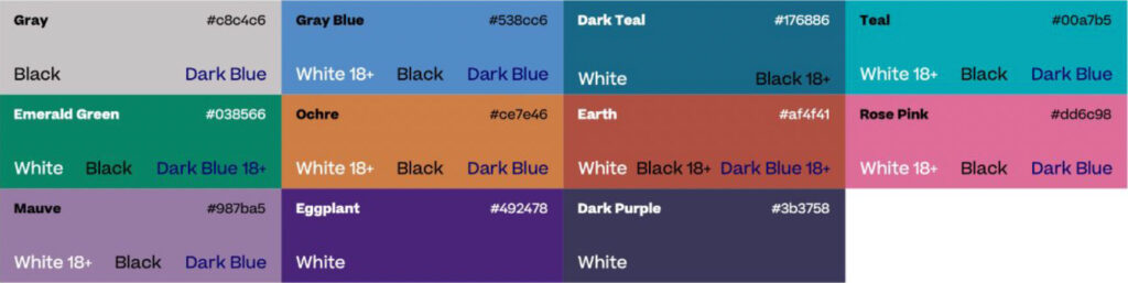
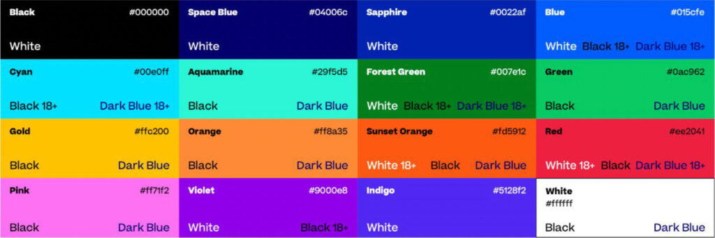
Accessibility is important to us.
We’ve tested our color palette according to Americans with Disabilities Act (ADA) Standards for Accessible Design to ensure our colors are accessible to all.
This chart is a guide to color combinations that have enough contrast to meet ADA AA compliance level requirements.
Our type colors are primarily black, white and dark blue. Font color names with 18+ denotes that copy must be over 18pt in size in order to be compliant. If the font color is not shown, it is not compliant and should not be used.
Vivid Palette
Neutral Palette